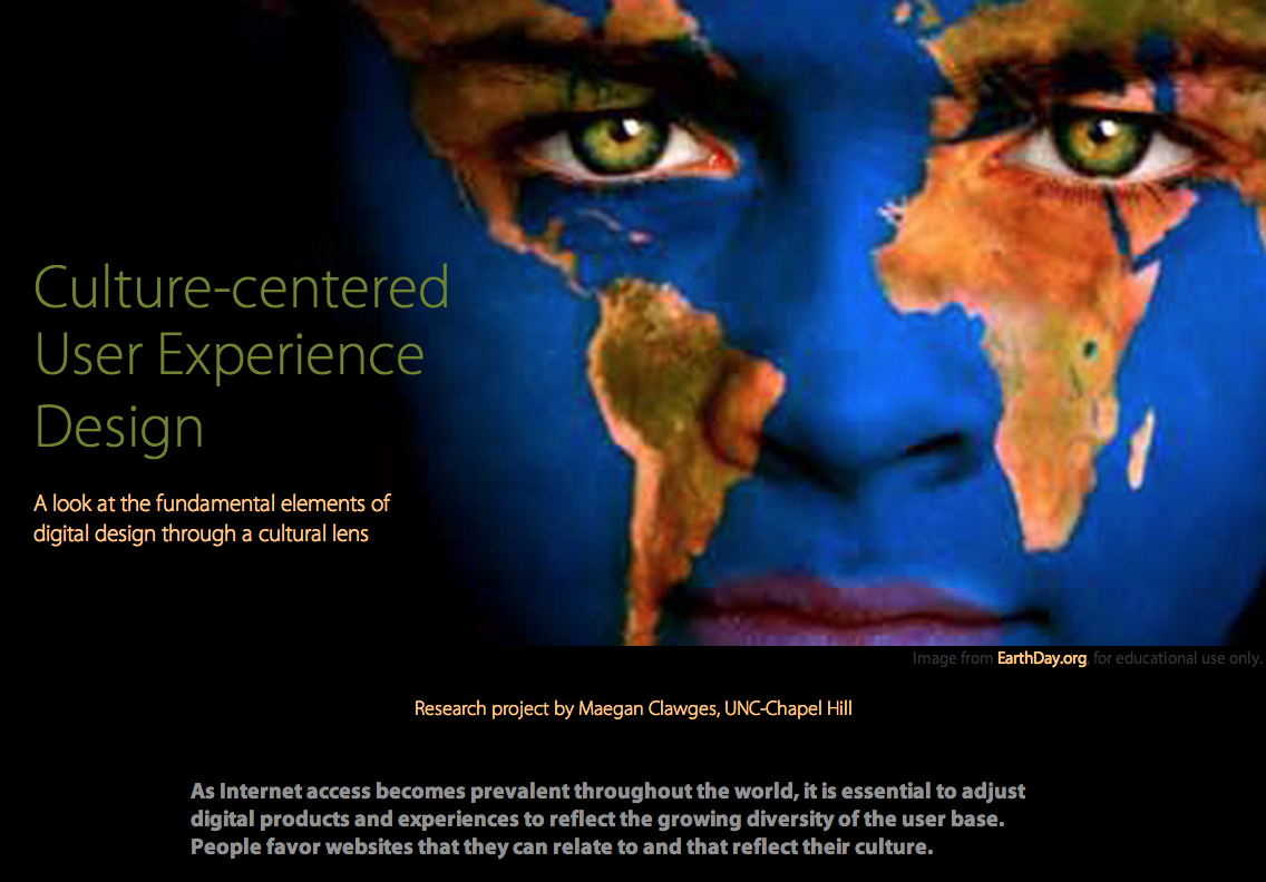
Culture-centered User Experience
An international communication research project
This is a semester research project for my International Communication class in the UNC Journalism School. We could focus on any topic that related to the class, as well as whatever format would be best for conveying our findings. I was especially interested in the internationalization and localization of UI design. I had been introduced to the conundrum of designing for international audiences during my internship at Microsoft during the summer of 2013. I worked on the User Experience team for Windows, which was used by 85% of computer users as of July 2013. The team did a lot of testing language translations, but were not as focused on layout and symbol translation. It can be challenging for a designer to find conceptual metaphors that make sense to people from another culture.
Note: This site is not accessible on mobile platforms because the nature of an in-depth research project did not lend itself to a mobile format and the intended audience was not likely to view it on a mobile device.
View the project live
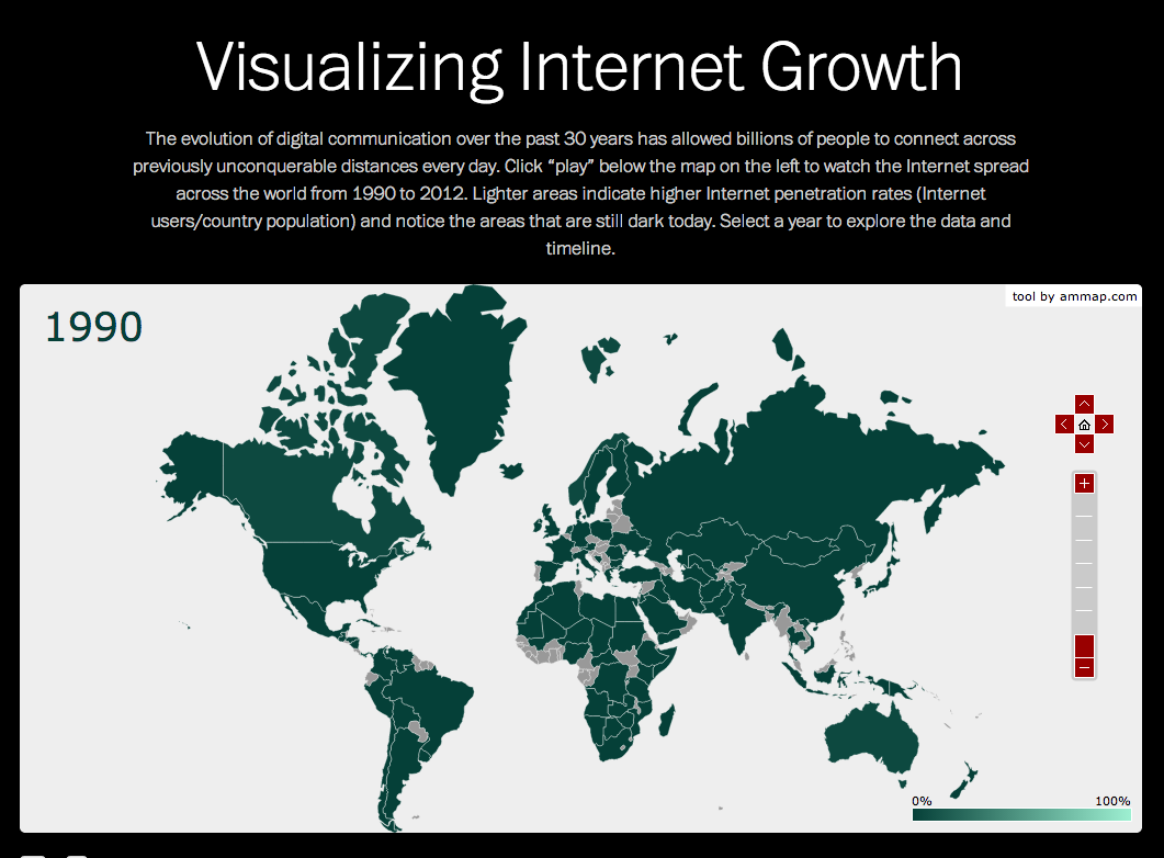
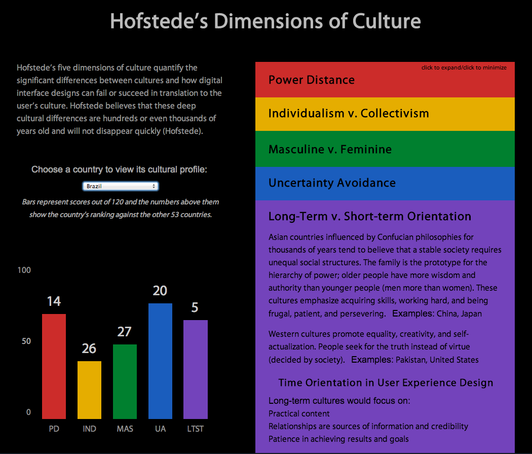
I chose to present my project through a website because it would be more accessible to the general public than the typical 16-page paper. This project is over two years old, but a lot of companies still struggle with this design approach. I included interactive data visualizations hoping to show why this type of work is so important. There is a world map of the growth of Internet access from 1990 to 2012 and a dynamic bar graph tool for comparing cultural values in different countries. See below for screenshots or visit the site.
The second half of the website is composed of case studies comparing 2013 versions of the McDonalds and Nokia homepages from different cultures. I found parallels in the elements that each company changed for certain countries. Layout, color, symbolism, type of photos used, etc.
In summary, this was one of the first websites I ever made and I was extremely proud of the data I collected and the analysis that I put together. The design of the site itself is somewhat outdated, but I think the information is still relevant.