Powering A Nation
An interactive web story about our relationship with water
Powering a Nation is an award-winning project that brings together students from different concentrations in the UNC Journalism School to create interactive storytelling content for the Powering a Nation website to spread awareness and understanding of the many energy issues America faces.
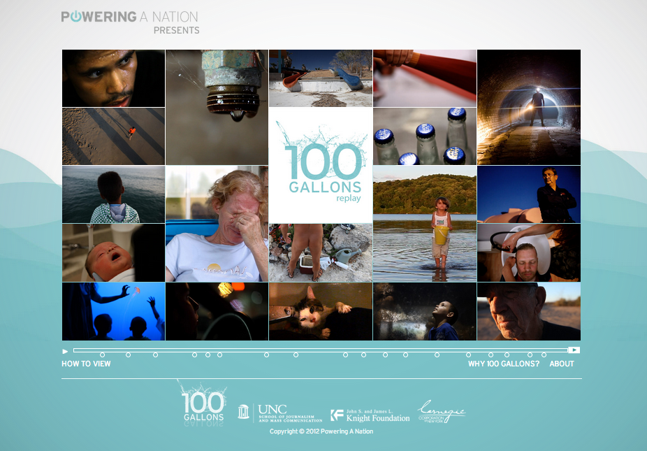
The 2013 theme was 100 Gallons, a look at an individual's daily interaction with water resources. I worked as a web designer and programmer on a 12-person team to develop content for the 100 Gallons site.
Note: The developers who began this project did not provide a framework for Internet Explorer compatibility. All links are best viewed on Google Chrome in a large browser window.
View the project live

Development Process
- We familiarized ourselves with water conservation issues and our specific project, 100 Gallons.
- Look for information gaps in the existing site content and brainstorm new topics.
- Conduct external research to flesh out our most intriguing ideas. As one of the web developers, I was focused on the storytelling format and experience. Here is some of my early inspiration for an engaging "scrolling" story:
- The team agreed to build an interactive page showing the life of a water droplet in the 21st century. The page would feature a parallax animation experience that we hoped would engage the reader in the page.
- We delegated the work between researchers, writers, videographers, graphic designers, interaction designers / programmers, and the marketing team.
- I used my research and programming background to lead the team in planning a storyboard that would be fluid and functional as a digital experience. It was challenging to integrate everyone's separate ideas into a single seamless web page, but the challenge pushed us to develop a truly top-notch product. You can view our sketches here.
- I worked with two other web developers to build the single page experience. I was responsible for the structure of the page itself, meaning the HTML and JavaScript that would produce the parallax effect we wanted to achieve. I loved working on this part of the project because I was able to play such an integral role in the flow of the page; every piece of content went through my hands. I also loved working closely with the designers. I provided them with my sketches and specs for the images we needed and they turned them into a reality.

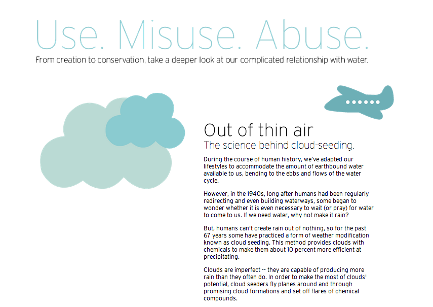
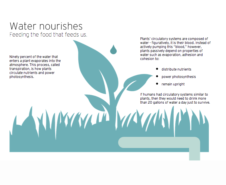
The finished project can be found at the last dot beneath the 100 Gallons concept video or here: Use. Misuse. Abuse. The site was nominated for a Webby in 2013. My biggest regret was that we didn't have time or resources to conduct user research throughout our brainstorming and production phases.

